On Sunday, you all got a brief peek in my head - apologies again... I know it can be a pretty scary place. LOL!
Anyway, today is a little bit more of the same. Today, I'll walk you through some color theory, as well as how I select fabrics for a quilt. I'm actually going to provide a couple of examples. Now, obviously the fabrics are an integral part of designing a quilt, so you'll get some insight as to the internal monologue that goes on as I debate fabrics and their potential design use. But first...
COLOR THEORY
 |
| http://www.artsconnected.org/toolkit/encyc_colorwheel.html |
But why is this important? Because every time you put a quilt together, you are a designer, and as a designer, there are some basics to be familiar with. Color can evoke so much emotion... Why else would we say we're feeling 'blue' when we feel sad? Or that we're 'seeing red' when we're angry.
Color can be an effective communications tool, if you choose to utilize it. I'm not saying it's wrong or bad to pick a color just because you like it. There is absolutely nothing wrong with that, and it is a completely valid color selection method. I'm just here to open a couple of doors for you. And, honestly, I'm just skimming the surface here... Entire books have been dedicated to this subject.
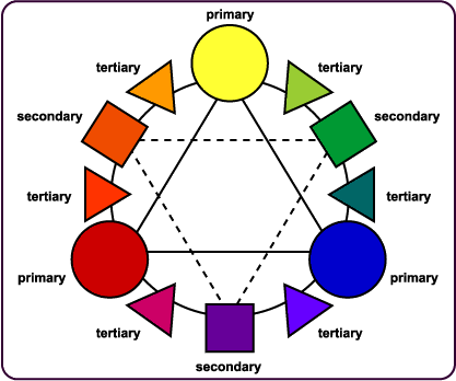
The Primary Colors we all know: red, blue, yellow. These are the simplest hues, and cannot be broken down into other colors - all colors on the color wheel are mixed from the primary colors. The Secondary Colors are violet, orange and green - they are the result of an an even mix of two of the primary colors, and also form a triangle. Tertiary Colors are the in-between colors, yellow-green, red-violent. They're created by mixing a Primary Color and a Secondary Color.
Complementary Colors are the colors that are directly across from each other, like red and green, yellow and purple. Using these colors together provide a lot of pop, because there's extreme contrast. If you want something to stand out, use complementary colors.
Analogous Colors are those colors that are next to each other on the wheel: red, red-orange, yellow. Monochromatic would be another way of saying this. It's easy to match in this grouping.
Warm Colors are the reds, oranges and yellow on the color wheel. Think summer and fire, the sun and baking. Cool Colors are green, blue and violet. Think winter and ice, rain and sleet.
Neutral Colors are your whites, creams, browns, and blacks, and grays.
Tints are pure colors mixed with white. These, naturally, get lighter with more white. Shades are pure colors mixed with black. These become darker.

Shades and tints are wonderful to play with because they'll give you something that falls into the same color family, while altering the values in your quilt. Oooh.. values!

In the first example above, the red seems overwhelmed by the black. Doesn't that red square in the middle of all that darkness seem so small compared to the others? Surprise! It's the exact same size as the rest of them. Example 2, the blue and red sample, practically vibrates off the screen - there's a lot of energy going on there. If you want to convey urgency and speed, use two primary colors together. Ever notice how most fast food places use primary colors in their logo? Yeah, that's totally deliberate.
Example 3 is red on green - that's a primary on a secondary. Notice, it's still got a lot of contrast, like Example 2, but it's a little more sedate. Not much, but it's not quite so eye-boggling. Example 4, shows how white can contain colors. The red holds its own more than it did in Example 1. Example 5 is a monochrome palette. The red threatens to disappear into the background. Example 6 utilizes my favorite neutral, gray. Gray does a better job of allowing the red to stand on its own.
For some books on color theory and better explanation's on how color and quilts work, I'd highly suggest Joen Wolfrom. She writes from a quilter's perspective, and has developed the 3-in-1 Color Tool to help purchasing fabrics easier. If you don't mind textbooks, Understanding Color: An Introduction for Designers by Linda Holtzschue is a good one.
And now, for the fun part! Actual fabric pics! I'll walk you through picking colors/fabrics from an inspiration fabric and picking colors for diversity.
INSPIRATION FABRICS
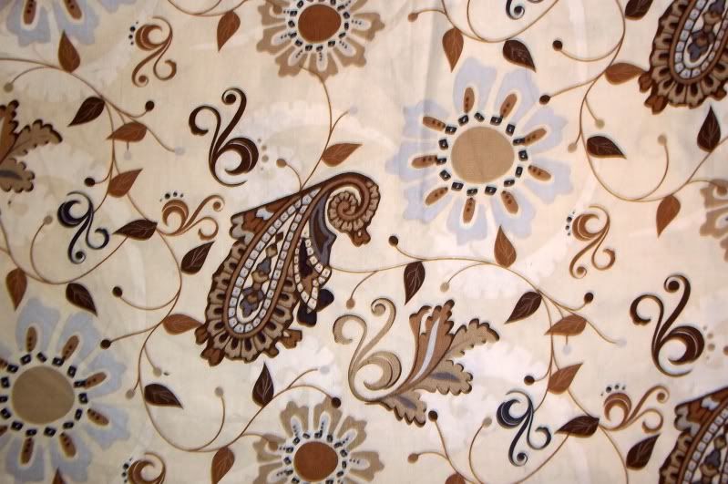
I'm a little weird, but you guys knew that already ;) I joke, and say that I work my way in from the outside of a quilt, meaning that I start with my border print and go from there. It's really not so much joking, though. It really is how I work. So, let's start with this particular bit of pretty:


Kind of freaky how much thought goes into just one fabric selection, isn't it? This is why color selection is so difficult! It's not just your tastes - it how the colors mix together to achieve the affect you as the designer are going for.
Let's add something else:

Let's add some more value differences:
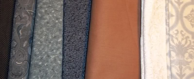
On the whole, I'm really happy with this grouping of fabrics. The only thing I feel is missing at this point is a blue solid or tone on tone to match the columbine blue flower petals. Looking at the grouping I have, I'd like to bring in an oatmeal color tone on tone or solid and that blue. Unfortunately, I don't have those on hand, but I think you guys get the idea. This is why I buy large scale prints.
STARTING WITH A LIMITED PALETTE
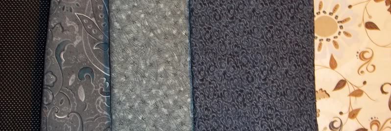
I know a lot of you enjoy working with single fabric lines. I've never before purchased the entirety of a fabric line, even in a pre-cut. The closest I got was to buy a number of the prints from the Exclusively Quilters Eclipse line:

So, anyway, now that I'm done drooling anew (even though I bought this stuff last summer)... This fabric is wonderful for this exercise because the palette is so limited. We've got white, black, a couple shades of gray, and yellow. However...
There's really only two scales represented here: large and medium. But wait! What about the one on the right? Look at the repeat a little closer: It's almost the same size as the sunflower in the middle print, roughly 4" square. The only thing that saves it from tippling over into being large scale is that it's drawn with thin lines.
But anyway, let's take a look at values, now that we've established that I'll need some small scale prints:

Okay. So now what?
Now we need some diversity. Just three fabrics makes for a super dull quilt. Looking at the three prints, I'm seeing a lot of curves. Let's change things up a little:

Since I'm working from my stash for this exercise, I'm extremely limited in the number of yellow fabrics I have to work with, but I'm also not sure at this point that I would do a lot of cutting into the yellow floral print. I already know that I'm not going to fussy cut this stuff - I'm far too lazy for that. Besides, if I fussy cut, I lose that glorious yellow, and I want to preserve as much of that as I can. I'm thinking that it would be nice as an inner border - but that's a step for the design phase!


However, I'm limited in yellow, and this quilt needs more color to it. I've got lots of neutrals. I really don't need to add any. My challenge here is to find a clear, clean color that works well with yellow and gray. I
already know that I'm not going to be playing with red, orange or green. All three of those colors are analogous to yellow, and I want something more diverse. However, having said this, I know I'm not playing with purple. Purple is too dark for my purposes in this instance and tints like lavender don't have enough value difference.
 No green, because acid and lime green are really what I buy, and there's not enough value difference, though I do love the contrast of the squares of the middle fabric against the scrolls of the main fabrics. If all else fails, then I 'll attempt to pull out the dark shades of teal-green that are in that fabric. Same story with orange - just not enough value difference, and orange is too close on the color wheel to make me happy. Red shows some promise, but then the gray, white and black are overwhelmed, not showcased alongside the red and yellow.
So, considering my stash at this point, I'm left with aquas and magentas.

Magenta's out, for the moment. Lets take a look at aquas:

Let's try adding something darker:


One of these days, I'll make quilts out of these two examples, and link you back to this. D'oh! I just added two more projects to the to-do list.
Hopefully, this was helpful. Again, so, so sorry for the delay. I'll be making a concentrated effort to be on task after this.
7 comments:
I really appreciate the effort you've put into these skill building posts. I'm sorry to hear about your depression and hope that whatever caused the funk is gone now.
Arg, my comment was eaten! Basically, what I said was that I second the commenter above, your fabric choices are out of the box for me so your explanations were great! I loved how you explained why something didn't work or did work. And I'd love to know more about working with neutrals. You used both to great effect in both of these pallets. How do you know when and where to use them. Should every quilt have them? Are they only to add variety to the values in your pallet? Thanks for showing this in such great detail!
Thank you for taking time to explain why colors and textures should be selected and why and when they should not. I adapt easier to visual presentations so thank you for showing what you mean with fabric vs. color chips. Excellent!
Loved this demonstration - It's something I think I understand, but seeing it in action solidifies the process and reinforces my confidence! Thanks!
I just found this whole series you and Sandi are doing and I LOVE it because I just bought and began cutting the fabric for my first quilt and have no idea what in the heck I am doing. I feel a lot more confident after reading all of these basics posts. Also, some of that blue in those bottom pictures are what's going into my first quilt, so I'm feeling pretty good about my fabric choices right now :)
Where can I buy the turquoise scrolls fabric? Please and Thank You :)
Thanks so much for taking us through the selection process step by step. Seeing what didn't work for you and why was so helpful.
Post a Comment
Questions? Comments? Random fact? Put it here!