Michelle, of Stitching in the Barn, left me with a wonderful comment on this post about picking out fabrics for a project. She had some great questions...
...which I want to address today!
DEFINING NEUTRALS
What, exactly, comprises a neutral? Going by color theory definition, a neutral colors are those that lack hue saturation. Traditionally, they are very light colors like gray, beige and taupe. They tend to be dusky in nature and may be also be called 'achromatic'. Naturally, we add in white and black as they're 'non-colors' as well.
WHEN IS A NEUTRAL NOT A NEUTRAL?
For those of us making quilts, it gets a little weird. Why? Because the thing about color theory is that it tends to be talking about solid samples, like paint chips. Those of us using fabric also have to consider a fabric's print and its scale. Trouble often arises when we attempt to harmonize several different prints, scales and values:
Pretty, right? Okay, so I just grabbed an assortment off of my stash shelves. Still, you get the idea. All these pretty colors and prints, but now what? There's a lot going on here, and the eye needs someplace to rest. A simple and effective solution is to add a neutral solid:
I grabbed my Kona Charcoal for this particular example. I'm very ambivalent about this particular shade of grey with these colors. Why? Because value just came into play:
That Kona charcoal is an almost exact value match for three of the seven fabrics. It shares value with the red print, in that the darker areas of red are very close in value. Due to these similarities in value, the Kona Charcoal ceases to be a neutral and just blends in with the other fabrics. The fact that it's a solid doesn't even save it from dulling out the other fabrics.
This makes the addition of the Charcoal pretty flat to me. In an instance like this, I'd probably go with white or black for higher value contrast. Unfortunately, I don't have solid white or black on hand to illustrate for you, so you'll have to use your imagine.
Now that we've added a neutral to a grouping of prints, what happens when we're working solely with neutrals?
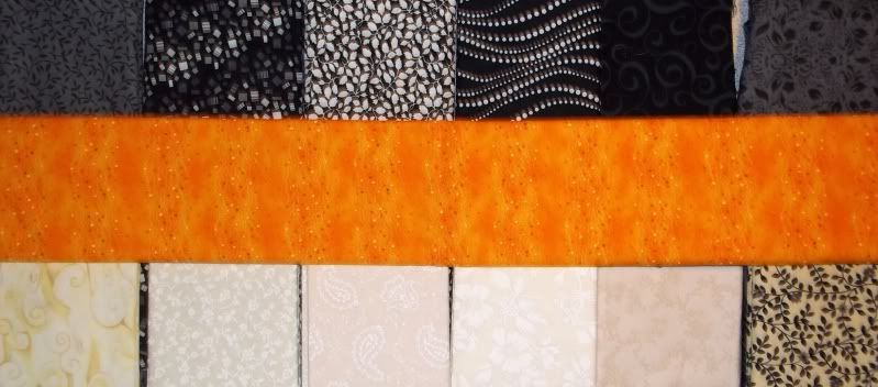
Well, we've got the extremes in scale and value pretty well covered. However, my eye keeps getting drawn to the white-on-white fabric, second from the bottom right. It's very glaringly white. I keep stopping at that one when I should continue travelling through the different fabrics, but it's not my neutral in this selection. At this point, they're all neutrals.
In this shot, the fabric got moved around a little, so I wasn't unnecessarily staring at the one that kept catching my eye before. However, notice that the orange added to the grouping is doing a couple of thing. It's serving as a mid-value in to the extremes of black and white. It's also the new resting point for the eye. Yes, in this case, orange is your neutral.
NEUTRALS IN YOUR FABRIC PALETTE
When does your fabric palette need a neutral? Honestly, I can't say that I've ever made a quilt that didn't use a neutral in some form. Every quilt that I've made has needed something to recede into the background so that the rest of the elements could gain preeminence.
But keep this in mind: A neutral is not necessarily a non-color!
A neutral can provide for you several things: a resting place, a unifying factor, a variation in value. Feel free to experiment, and hopefully this little segment helped a little.


2 comments:
Very interesting - and a bit harder for me to digest with art school colour theory whizzing around my head!
Thanks for the terrific post about neutrals- I have never thought about orange being a neutral but I can see where it is in the example that you gave. I have been cutting strips all weekend for a new quilt. This post gave me some other things to consider.
Regards,
Anna
Post a Comment
Questions? Comments? Random fact? Put it here!