My Kona Lake arrived on Thursday of this past week. Yes, in fact, I
had ordered it two weeks ago.
fabric.com mistakenly sent me a truly hideous six yards of some slate blue print that had different pairs of ice skates all over it. Actually, there really aren't words for me to describe this stuff, so a photo will have to suffice:
Needless to say, I was pretty well horrified. Any person that I've sewn with or has seen my stash knows that I'm just not a novelty fabric person. Thankfully,
fabric.com switched out the fabrics with no fuss, but I was delayed in picking out my fabrics as a result.
Now, I
was going to work on my Kona Solids Challenge today. Upon sitting down to actually sew some of it, I realized that I just didn't feel like I had enough different fabrics to produce the right number of gradients.
So, yes, I
did go and order two more Kona Cotton Charm packs, and the Kona Color Card, thank you very much. Yes, I know that my self-control sucks. What do you expect? I'm a quilter, which means that I and a serious fabric addiction go hand in hand. Needless to say, that particular challenge project is being put on the back burner until my goodies arrive.
Moving on...
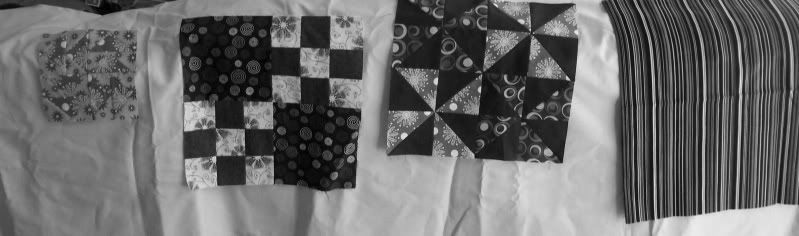
Using the highly scientific method of draping fabric over the back of my couch, I first auditioned the blocks I'd made for the Skill Builder Series tutorials. I was quite pleasantly surprised to find that I really liked how the majority of them worked. The fabric on the far right is my binding fabric.
I converted the photo to black and white, so that I could judge values. I was surprised to find that I liked having the yellow fabric. My eyes had deceived me, and it's actually lighter in value than the Kona Lake. Not by a lot, but enough to make a difference. This made me decide against the fabrics in the far left block. That salmon color just gets lost against the Kona Lake.
I played a little more, a process which I did not document in photos, but should have... I ended up discarding the yellow floral entirely, and switching in another yellow. With the exception of the brown background dots fabric, all of my selections are tone on tone, or nearly so. (Gee, what a surprise, right?)
I knew right away that I wanted to keep the three fabrics on the left. Despite the similarity in color to the background, I opted for the teal on the far right. I needed something other than that spruce green to bring some balance to the otherwise very warm tones I'm using. The yellow floral got switched, as I'd mentioned before, but mainly because I like the idea of having three prints that have a circular motif to them. I played with a couple of different shades of wine red (I have a lot to pick from), but ultimately went with the print shown above because of the lack of gray in the color. I needed something fairly pure in tone to foil against the very vibrant orange.
It's serendipitous that the fabric that I picked for the binding coordinates so well, especially considering that I didn't have any of my blocks with me at the WI Quilt Expo. And I totally winged picking the color of my background, just praying that the Kona Lake was close enough to the very pale aqua in the striped fabric that I wouldn't notice a difference. I got
really lucky.
And now, maybe I can actually go sew something!


2 comments:
Love it, JeannE.
Looks great!
I would have been horrified at the skate fabric too!!
Post a Comment
Questions? Comments? Random fact? Put it here!