Sunday, June 27, 2010

Process Post - Asterisks

I know!  Four posts in a single weekend!  *gasp*  But, I promised to show off more of my process, and there's no time like the present, particularly when a sweet, but demanding two year old is off with Grandma!

Well, this is invariably the beginning of any quilt (that involves any real planning) for me: a basic black and white sketch, with notes about what colors I want to use, some basic size ideas, and what inspired this particular sketch.

                        
As clearly stated by the second image, I was inspired by a purchase of Omnigrid's new Flip-N-Cut Magic Templates.  The link leads to Set 4, but all the sets are the same templates, just in different sizes.  I think I bought Set 3.  

Once I cracked open my templates, I realized that the scale of my vision would have to be reduced drastically, if I didn't want to buy another set of templates, which I don't, teehee.  Nor do I really want to go exchange the things, mainly because I no longer have the receipt.  I've also become quite content with the idea of this becoming a mini-quilt, anyway.  I need some pretty stuff to put on my walls.

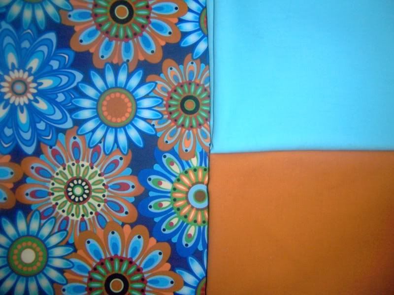
I was also inspired by the colors I used in my Modify Tradition Quilt, Modern Beauty: aqua, orange, yellow, lime green.  I wrote in to add pink, for a little more in the way of brightness, to contrast against the (intended) gray of the asterisks.  

I intend on recycling the borders I had planned on using on Modern Beauty, but I have to take them apart, so that I can intersperse the other colors.  The borders are comprised of the yellow and aqua fabrics from the arcs of the New York Beauty blocks, sized 1" X 3".  It's a nice size, perfect for the templates I have (I think).  

The color of the asterisks may morph into a cherry red...  I dropped the red fabric that I've been using in Japanese Disco on top of the borders, and really liked the way it popped off the blue and yellow, so I'll be doing some test pieces.  Who knows?  This could work out to be a whole series of asterisk based quilts.

And now, just to give myself a sense of perspective, so that I'm motivated to clean my sewing room before I get to sewing some more...  My list of quilts in progress:

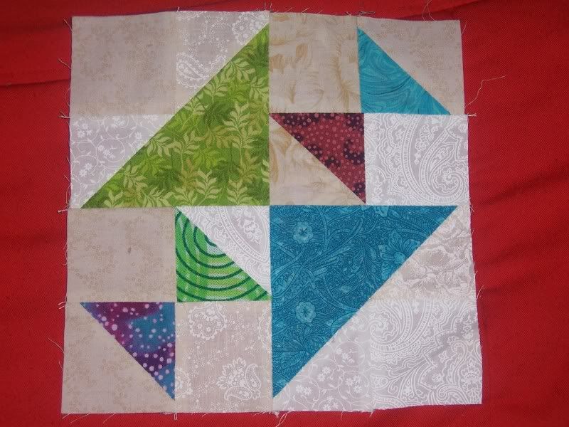
  • Sandi's Family & Friends Baskets
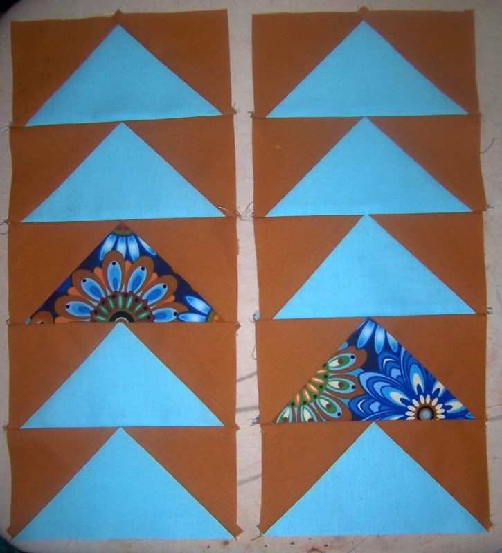
  • Japanese Disco
  • Asterisks
  • Flying Geese III
  • Blockade Scrap Quilt (from my LiveJournal Birthday Block Swap)

Yup, definitely time to tame the sewing room before I start up my sewing machine.  I won't show off pictures - I'm too ashamed.  Between my creative fits, and and Zeb playing, it's a disaster.

Saturday, June 26, 2010

Flying Geese III

Remember these?

Yeah, I know.  I just showed those fabrics off.  Well, I couldn't wait to cut into them and start piecing, so I didn't pre-wash and iron.  *gasp*  I know!  I'm almost sort of horrified too.  Of course, now that I've gone done it, I'm really thinking that might become my modus operandi.

But that's a tangent!  Look, look, look!


Heehee...  At Sandi's suggestion, I'm incorporating a few geese in the focal print.  I know it's just a start, but I'm super excited.  I'm just totally in love with these fabrics, never mind that  two of them are solids.  I'm in a state of creativity that is very receptive to solids at the moment.  Actually, let me re-phrase that:

I'm in a state of creativity that is very receptive to non-neutral solids at the moment.  I've always loved solids, but they were always neutrals: white, black, gray, beige...  Colored solids are damned near an innovation for me.

On the topic of fabric...  The above is a perfect illustration of why I dislike matchy-matchy fabric lines.  There's no focal point in a quilt that uses fabrics from the same line.  There's no star, no pop.  Just a lot of the same shades and tones, and similar shapes.  Boring.  Very.  Boring.

If I limited myself to working within fabric lines, I'd never have given that focal print a second glance.  Hell, I probably would have never noticed it.  It wouldn't have spoken to me.

And, yes, I know that fabric lines can simplify the buying and planning process.  But where is the artist's input into that quilt then?  Yes, you, the artist.  You, the person buying and cutting and sewing those fabrics, should have a deeper investment into the fabrics that you're pouring your creative energy into.

Go wild!  Get out of that matchy-matchy box.  Experiment!  Live a little!  Play.

It's just fabric and thread.  It's not like you can't pull out your seam ripper if it doesn't match your mental vision.  The process of taking a cut of fabric into a work of art should be fun and engaging, challenging and inspiring.

Not an exercise in how well you can display someone else's vision, as pretty as those visions are.

Now, off my soapbox and on to another subject... I was surfing quilting blogs, and came across Naptime Quilter, who is amazingly talented as well as being a funny, intelligent writer, and this particular post.  What really caught me was this quote:
Well, I would now argue that modern quilting is actually just really, really traditional quilting. Before people got caught up in intricate pieced patterns with a million different templates and detailed quilting.
Followed by this:
Oh, and just because you throw the word wonky or improv in front of it doesn't necessarily make it modern.
Teehee.

A woman after my own heart.

Don't get me wrong.  I love the 'modern' quilt movement, and I am happy that I'm participating in my area Modern Quilt Guild, but really, the quilts I'm most attracted to, are most similar to very traditional quilts, barring modern color choices.  And really, I can't say that my quilting predecessors wouldn't have picked the very fabrics that I select now.  They just didn't have the same options I do now.

Anyway, I encourage you to go and check out Naptime Quilter's blog.  Enjoy the reading, and enjoy looking at the pretties ;)

MMMQG Meeting - June 18, 2010

We met at Tea and Textiles, a wonderful quilt shop in Jefferson (sorry, no website).  I am totally in love with this store!  The owner is older, but you wouldn't be able to tell from the selection of fabrics on the shelves.  Food themed fabrics are clearly popular - I spotted French fries, raspberries, and chili peppers, to name a few.  I'm pretty much 'meh' on the whole subject of novelty prints, but I understand that some people just love them to death.  But anyway, Tea and Textiles has, by far, the best selection of bright fabrics that I've seen in a while.

Unfortunately, this particular Saturday, only three of us got together: Sandi of Piecemeal Quilts, Cheryl of Cheryl's Chatelaine, and myself.  Sandi and I showed Cheryl some paper-piecing, though Sandi is a far better teacher than I ever will be ;)

I brought a plenty to do...  I had intended to finish Block 12 of Sandi's Basket Blocks, and got through the handle - or so I thought.  Somehow, I had print and cut two of the same half of the basket handle.  Thankfully, it took a simple flip-flop of a single piece to make it all better, but that pretty much took the wind out of my sails for that particular project.

Tucking that out of the way, I decided, "Fine, I'll piece the sashing strips for setting the basket blocks."  That went well.  For the most part.  In showing Cheryl paper-piecing a square in a square, I decided to use the scraps from my sashing strips.  Then, silly me, I set that square-in-a-square next to a sashing strip.  My brain went on a creative tangent and said, "THIS IS A QUILT!!"

I quickly auditioned white, to sash the square-in-a-square blocks with, and decided it was too harsh.  Sandi made the brilliant suggestion that it needed something more silver-y, and we headed back to the sales floor.  She pulled out a bolt that we both loved, a gray paisley.  It was pretty, but not right - too dark.  However, just a few bolts down was a bolt of Michael Miller's Mirror Dots in a silver-y print.  It was perfect!  I'm going to fussy cut the Mirror Dots, so that there's a full line of dots in the sashing, but that's gotta happen after I was the fabric.

The quilt, unfinished as it is, already has a name!  "Japanese Disco".  Cheryl made the comment that the sashing strips looked like obi from kimono (if I remember right, lol), and Sandi said that the Mirror Dots gave it a disco look.  So, "Japanese Disco".  I hurried up and borrowed a pen from the shop owner and sketched out my idea, so that I would have a record of it.

The Mirror Dots was actually my second purchase of the day at Tea and Textiles.  After lunch, which was an awesome burger at a place called Urban's, Sandi and I did some shopping.  First, I thought I would buy a print that incorporated asterisks, to go along with the beginnings of a mini-quilt that's been burning in my brain for a couple of weeks.  But then I put the fabric along side the stacked coin strips I have pieced already, and it was just too white.  (I'll go into more detail about "Asterisks" in a later post, when I have more to show for it.)

So, I put the bolt of asterisk print back and wandered some more.  I kept getting drawn back to this wonderful print of simplified flowers.  What kept drawing me was not only the great graphic sense I got  from the fabric, but the unusual color combinations: robin's egg blue, burnt umber, deep orange, cobalt blue, kelly green, cream... I was in love, and after going back to look at it a third time, I decided to buy it.  Then, I had to get some solids - this fabric needed solids to ground, yet uplift it.  I picked up some Kona cotton in a robin's egg blue, and another in a burnt umber.  The solids are just a couple of shades off of those in the main fabric, but they're perfect because they don't match perfectly.  They give just a bit more interest:


These three fabrics will end up being a Flying Geese quilt (Edit: Now titled' Escapees'), because I love that print, so much!  However, I'm totally stuck on the idea of adding a green solid, to border in the print before adding the strips of Flying Geese.

My Process...


I did it...  I jumped on the Process Pledge bandwagon.


...And that's a good thing.


I tend to go from spark of an idea, directly to mostly finished project, with very little record of how I got from Point A to Point ZZ, never mind the tangents that occurred on that particular journey.


Thanks to this pledge, I've already done a far better job of documenting my inspirations sketches in the last two months than I have in the entire previous fourteen years of quilting.


Part of my lack of documentation is that I never needed to document anything.  I have a very visual mind, with excellent spatial planning skills, as well as the practical quilting skills to make my project match my mental vision.  I can look at a fabric, and know what I want to do with it.  I can picture the final item, with very little trouble.


Now, I'm carrying around a three ring binder, with blank pages of notebook paper in it, along with a black ball point pen.


Why a pen?  So I can't second guess my original gut instinct.  I'm often most happy with my initial design idea.  Why ruin a good thing with second guesses?


Why black? If a design can stand on it's own in black and white, it can stand the addition of color.  And it leaves a lot of room to imagine different color schemes.  


It's kind of inspiring too...  If I remember to record it all, I end up recording the mental creative tangents that might have otherwise gotten lost, and then I can follow those threads at a later time.


Anyway...


Expect to see more here on this blog about working from start to finish.  Surprisingly, this pledge has actually made me more motivated to move forward with my projects.

Sunday, June 13, 2010

Modify Tradition Mini-Quilt - "Modern Beauty"


It's Finished!


When I read my partners description of what colors she liked, I immediately knew what I wanted to make.  I've wanted to make a New York Beauty quilt for ages, but didn't want to make it out of traditional colors.  My partner's color preferences made this a simple leap, and the image of the quilt sprang into my mind fully formed.

The decision was made, very quickly, to have two shades of gray in the quilt, to contrast against the bright colors I'd decided on: lime green and orange, in at least four different patterns of each color.

Right away, I ran into a snag.  I opted to use one of Donna Duquette's free PDF patterns, loving the incorporation of the Flying Geese.  As far as modernizing my pattern, this was a two-fer!  It's a beautiful block, but I totally missed that center arc, between the points and the Flying Geese.

Not a big deal.  Improvisation to the rescue!  I decided to keep cool and warm tones separate, and used bright yellow arcs with the orange quadrants and aqua arcs with the lime green quadrants.  Very aesthetically pleasing, I thought.

Piecing those arcs...  I always forget how much I hate doing curved seams through so much bulk until I'm too committed to a project to back out, and that's what happened this time around.  No matter how much I pinned (and accordingly, stabbed myself with said pins) I could not get the $(#(&$ center quarter circles to do a smooth curve.  After the third try, I said the heck with it, and moved on.

I have to do that occasionally, or forget entirely about deadlines or even finishing in the first place.

That left me with the center panel that everyone sees now.  I then decided I wanted more aqua and yellow, because those arcs just looked sad and lonely, and there needed to be more aqua and yellow to justify their inclusion in the quilt.  So, I pieced a stacked coins border out of 1" X 3" strips of the aqua and yellow.  I added a 1" orange border, then tacked on the stacked coins border.

I hated it.  It detracted so much from the center, drawing the eye away from that explosion of color... I hated it.

I spent an hour making like a frog and RIPPITed RIPPITed those two seams out.

This left me with the dilemma of how to include more yellow and aqua without taking away from the orange and green.  Some rummaging through my thread organizer, and I stumbled across the answer:  polyester machine embroidery thread!  In aqua and yellow!!  I already had the aqua, so I did some playing with test stitching with my sewing machine.

Happy, happy, joy, joy!  I loved the way it looked, so I experimented in the body of the quilt.  The aqua embroidery is not nearly as good as the yellow, but that's because I realized that I needed to put the spool of thread on the spindle backwards to get a smooth feed through the machine.  However, it gives each portion of embroidery a unique look that I like a lot.

I already knew that I wanted to bind the quilt in lime green.  Some quick auditioning of the fabrics that I used in the quilt itself, and my choice was made.  I wanted the bright color, but not the heavy patterning, so I went with the marble-like lime green print.

Eight hours of piecing - yeah, it really did take two hours a block.  Eight hours of quilting/machine embroidery.  One and a half hours to attach the binding, the hanging tabs, and the label.  That's right.  Roughly twenty hours for a slightly smaller than 17" X 17" mini quilt.

Hubby says I try too hard for these swap thingies.  Of course, he says that in the same breath that he says he wishes I could keep this quilt for us, lol.  I think I have it in me to make another one.  I have plenty of material for it!

Birthday Block Progress

I've been stitching like a madwoman, trying to get things done for the various swaps I'm in, primarily the Birthday Block Swap.  I'll actually be a bit ahead, once I get everything mailed out!  The secret has been to simply sit down and get everything cut out, stored in my take-along bag, and then I'm ready no matter where I happen to be sewing.

For cristalsky, quilter's choice blocks in various shades of white and cream:

For mommy09, spring-themed blocks in bright colors with a white background:

For maydela, wonky house blocks, in our favorite colors.  I love all colors, so:

For sewinginbison, scrappy 8" Bouncing Betty blocks:

For Treeville Mary, Crazy Anne blocks, in batiks: