Tuesday, May 31, 2011

PM/GC Skill Builders Series Part 8B - Flying Geese

6Check out Sandi's post on flying geese here.

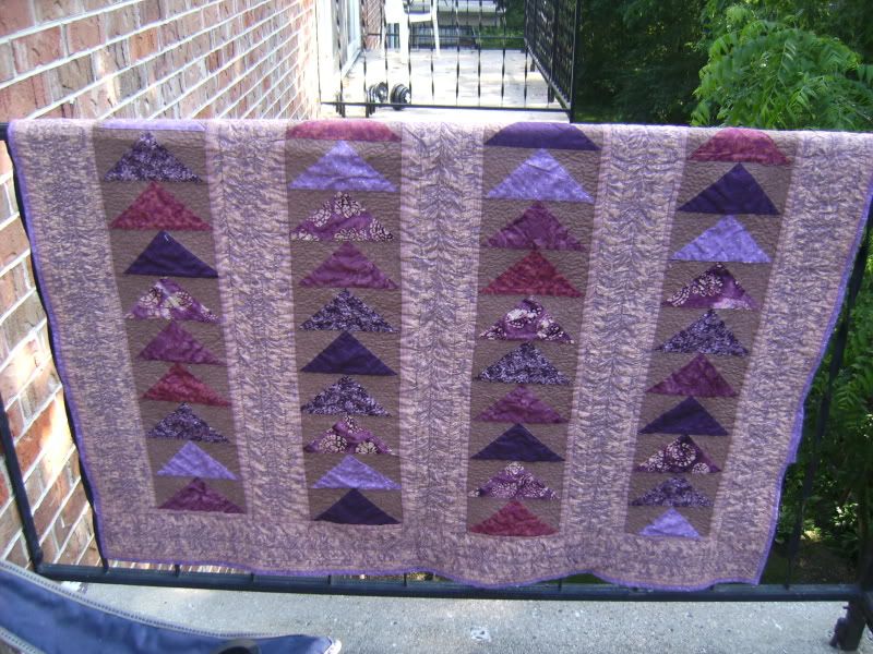
I love flying geese. Love, love, love them. So much so that I've made two quilts and one top:


Is there an end in sight? Probably not. They're just so much fun!

And so much more fun now that I know how to make FOUR flying geese from nothing but squares... No, I'm really not kidding! Read on...

In general, the accepted proportions for flying geese is that the width is twice the height. Since we want to end up with a Flying Dutchman Block that is 12" x 12", our flying geese need to finish at 3" by 6". Now that you know how large your flying geese need to be, you can get started with this super simple method.

All you have to do is take the finished width of your geese (6") and add 1 1/4" to it. That's your starting square size: 7 1/4". Now, I like to trim down, so I actually made my starting squares a quarter inch bigger, rounding up to 7 1/2".  For your sky triangles, the finished height of your geese is 3". If you remember the magic number for Half Square Triangles (because that's what the sky pieces are) you already know we need to add 7/8" to get the size you need to cut your sky squares to. Again, I trim down, so instead of 3 7/8", I cut mine at 4".

1.) Now, to make a Flying Dutchman, you need a total of eight flying geese. This means you need two squares at 7 1/2" and eight squares at 4".

2.) This next step you can just ignore... I like to do it, because I'm anal retentive. Just draw two lines on the 7 1/2" squares, from corner to corner, making an 'X'.


3.) Take your 4" squares, and draw one line from corner to corner, bisecting the square. That's your cut line.

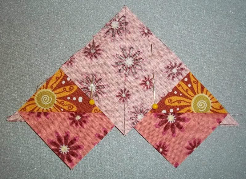
4.) Now all the lines are drawn, take a big square and two little ones and pin them together like so:


5.) See a quarter inch seam on either side of the center line - I know it's kind of hard to see. Sorry! It didn't occur to me until after I was underway that I should have switched to black thread.


6.) All right. You've got two seams sewn in. Cut down the middle, following that center line that you just sewed alongside. I thought I took a photo of that, but clearly, I'm insane. Anyway, once it's cut, and you have two triangles, it's time to break out the iron.

7.) Press that sub-unit open, and you should have something that looks like a heart. Actually, you'll have two of them. Apply all of the following steps to both hearts.


8.) And don't worry! We're still on the right track. Take another 4" square and pin it to the sub-unit:


9.) Again, sew a quarter inch seam along either side of your drawn line:


10.) Now, cut in half (Yes, I know... a little late to actually have the post cutting pic):


Rinse and repeat all the steps for your second set of squares, and ta-daa!!


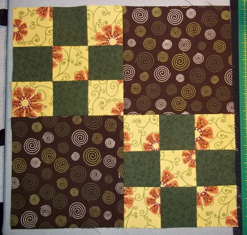
Eight perfect flying geese. Trim down to 3.5" by 6.5". then you're all set to make your Flying Dutchman block:


Don't you want to make tons and tons of flying geese now?  It's SO easy this way.

Sunday, May 22, 2011

PM/GC Skill Builders Series Part 7 - Leader/Ender Projects

Look familiar?

I use these all the time... Threads get tangled under the sewing plate or right at the beginning of the fabric, created snarls that make us snarl.

Just a little scrap of fabric, zipped under the sewing foot right before I start sewing patches together. Keeps everything nice and neat, and I'm not making like a frog more often than I need to be.

So, what's my point, right?

You might have read about Leader/Ender projects on other blogs. I have to admit, I don't use them as much I as could. I've got a ton of scraps, but I haven't really started making use of them in a while - Zebediah likes to use them to play in. He likes Momma to bury him in scraps.

Anyway... Leader/Ender projects are a great way to use scraps, OR to make blocks comprised of lots of small pieces. Typically, you see a lot of postage stamp quilts done this way, but really, anything could be done as a Leader/Ender projects.

The theory is that you just start off sewing patches together in pairs, starting off your piecing with a Leader, and sewing what you've set out to sew, and then ending with, well, an Ender. The trick is to leave that Ender under the needle without cutting the thread, so that you can just get right to it next time you sit down at your machine.

It just takes a little preparation.  Cut a bunch of your pieces and have them ready to go whenever you are. It's totally up to you what size and shape patches. Some projects that I think would make awesome Leader/Ender projects: anything scrappy, Double Wedding Rings, Postage Stamps Quilts, Stacked Coins...

The sky's the limit. I recommend selecting a project that you think you'd never have the patience to do otherwise. You'll build progress long before you realize it, and it's really confidence building to suddenly look and realize that you've got a good chunk of a quilt top ready to go with some chain piecing. That's why I mentioned the Double Wedding Ring. A lot of us have a lot of fear over some patterns. Leader/Ender projects are a great way to break something down into manageable chunks.

Check out http://www.quiltville.com/leadersenders.shtml for some excellent and diverse examples. There is a book out there too: Adventures With Leaders & Enders. Again, the sky is limit. Just get adventurous with them.

I have to admit - I've never really used Leaders and Enders, but I really should. It's such a useful way of getting something done without getting bogged down in the "will I ever finish this?" or the "why did I start this?"

Wednesday, May 18, 2011

PM/GC Skill Builders Series Part 6B - Nine Patches and Strip Piecing

I've been absent for a bit...

My mother-in-law went into for a routine mammogram a couple of weeks ago. The results weren't exactly routine. Lumps were found, and her doctor sent her home with the expectation that she was likely dealing with breast cancer. Five days after the lumps were found, my mother-in-law underwent a lumpectomy, so that they could be biopsied. I've seen my husband worried and scared before, but never to such a degree. He lost his father when he was twelve, so this was agonizing for him.

Two days of anxious waiting after the lumpectomy - It's not cancer. Thank God.

So, the last couple of weeks have been spent keeping kiddo out of grandma's hair so that she could recuperate and re-connecting as a family. Sometimes it's just so easy to forget how much certain people mean to one's life. I haven't lost nearly as much family as my husband has, so it's one of those lessons that just hit home, and I wanted to hunker down with the family for a bit.

Now, having said that, I'm BACK! Again, lol. I've rediscovered that more than five hours of sleep really screws me up - I spend the day tired and groggy. I'm so much better off sleeping less rather than more. So, these hours between midnight and 2 AM - those are MY hours. I'm re-claiming them for sewing and writing.

Now, let's get down to business:

STRIP PIECING IS OUR FRIEND!

If you haven't strip-pieced yet, you're going to ask yourself why you haven't done this yet! It's so simple, and is really just a matter of forethought. Nine-patches are a great way to learn strip piece. I've decided to make a Double Nine Patch block today that finishes at 12", to complement Sandi's lesson here.

Strip-piecing is exactly as it sounds: You piece longer strips together, and cut those pre-pieced strips so that you've made several subunits with way less cutting and matching. You just have to know how long your strips should start out at, which is super simple multiplication. For instance, our Double Nine Patch block requires that the starting squares be 2.5" each.

Since I'm only making one block, it's really not that big a deal to cut a bunch of 2.5" squares and piece them together. However, if I needed to make several of the same block, there is no way that I'm cutting that many 2.5" squares and trusting that they'll all remain where I need them to.  Thus, a little multiplication.

Nine patch blocks break down easily into three sections, of alternating values. This means that I have two identical sections and one that differs. Since I'm making two nine patch blocks, I need four and two. 2.5" times four is 10" in length, and 2.5" times two is 5" in length. You'll see where these come into play in a bit.

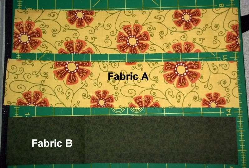
Start off by cutting two 2.5" x 10" strips of Fabric A and one the same size of Fabric B if you feel comfortable cutting the length exactly. I cut my strips at 2.5" x 12" because I prefer to trim down and be sure that my sub-units are the correct sizes.Then cut two 2.5" x 5" strips of Fabric B and one the same size of Fabric A. Again, I actually left the length longer, so that I could be sure of the finished sizes of segments.


Now, just take one 2.5 x 10" strip each of Fabric A and Fabric B and put them right sides together. Sew a scant 1/4" seam along the full 10" length. Take the second strip of Fabric A and sew to the other side of Fabric B, so that your fabrics alternate.  Do the same for the 2.5" x 5" strips, just ensure that Fabric A is your center fabric.

Iron your seams open or to one side. Again, I'm a seams open gal. Your strip units should appear something like:
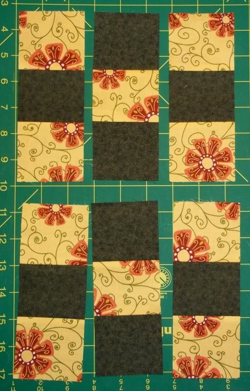
Once your seams are all behaving, cut four 2.5" wide segments from your 10" strip. Cut two 2.5" wide segment from your 5" strip. You should have a set of six sub-units like this:
I've laid them out in the order that the finished blocks will appear, because I'm visual and have to see them in the right order as I'm piecing, or I freak out constantly and second-guess myself.

Sew your sub-units together and you should have two nine-patch blocks:
Now that you've got two perfect 6.5" nine patch blocks, but now you need two 6.5" squares cut from a single fabric to make a Double Nine Patch. Go on and cut those, and sew all four units together to make a block like so:
And there you have it! Strip-piecing is a wonderful technique that takes away a lot of the "OMG! So many pieces!" agony that we all experience at some point.

Wednesday, April 27, 2011

PM/GC Skill Builders Series Part 5 - Fabric Fundamentals...

...or, We Bought the Pretties. Now What Do We Do With It?!? (For Sandi's segment on Quarter Inch Seams, go here.) This is a word-heavy post. Some things there are just no photos for...


Getting to Know Your Fabric

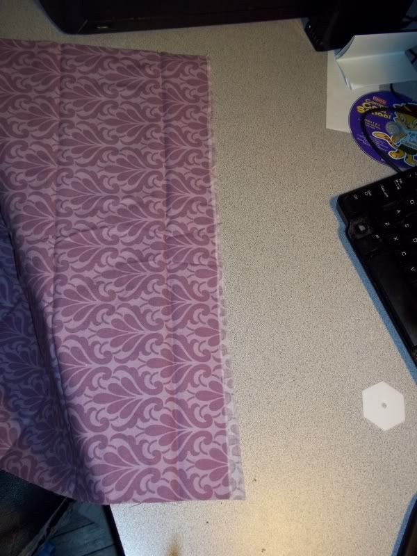
Straight of grain runs parallel to the selvage. In the photo below, I selected a fabric with a clearly denoted selvage. Look for the finished border to your fabric, running along the length of it, with fabric that's been printed to the edge. When you pull the fabric along the straight of grain, there is very little give. Your cross grain is exactly what it sounds like and run perpendicular to the the straight of grain. You'll find that the cross grain has more give. Some folks say that you can tell the difference between cross grain and straight of grain by the sharpness of the sound when you snap the fabric. I couldn't tell you - I've never done it.

True bias runs at a 45 degree angle to your selvage or straight of grain. This is important to be aware of because bias cut fabric will have a lot of stretch. This is why bias binding is used for curves.
But, whoops! We've cut the selvage off our fabric, as in the photo below. How do we create a truly straight edge in order to avoid bias edges?

1.) Make a small cut through only one layer of fabric, perhaps an inch long:
2.) Take that little bit of fabric and RIP it. Seriously. Rip the fabric with your bare hands. It's easy. (Yeah, Zeb had to get involved when he saw a camera out).
3.) Align your newly straight edges and cut as usual.You can see some of the thread of the fabric that got pulled out. That's nothing to worry about.

To Pre-Wash Or Not?

I used to be a dedicated pre-washer. In fact, I still pre-wash. However, now I have a lot more information at my disposal. My new answer to the pre-washing debate, which actually comes up quite a bit, is "It depends".

"It depends on what?" you might ask.

First of all, am I going to simply stash the fabric question? If yes, then I am quite likely to just put it on the shelves without washing.  Now, why would I do that? Because fabric straight off the bolt has been chemically treated with preservatives that are stain resistant, maintain pH balance, mitigate discoloration, prevent mold and fungi infestations, and, in general, keep our own handling of the fabrics from harming them further.  

Yes, I said that our own handling of material damages fabrics. I give you Locard's Principle of Exchange, which states that 'with contact between two items, there will always be an exchange'. This principle is typically connected with forensic sciences, but those of who collect (whether we collect fabrics, yarns, buttons, or coins) need to be aware of it too. Basically, it means that no matter how minute the contact is between me and my fabric, I'm going to leave evidence of that contact.

This will typically be in the form of oil from my skin (which can be harmful all on its lonesome, carrying dirt, disease and acid), but what if I was just scrubbing my kitchen floor with bleach in the mop water before I went to work in the sewing room? No matter how well I scrub, there will still be traces of that bleach on my hands. Now, imagine that I touched my fabric. I might have just created a series of small, slowly self-bleaching spots on my fabric, if I've pre-washed, and especially if my fabric is exposed to sunlight in concentrated amounts.

If I had left my stash fabrics unwashed, that bleach might not have become a problem. The layer of preservative that I left intact would have continued to do their job and keep my fabric looking as crisp and bright as the day I bought it.

I also have a little boy who likes to play in my fabrics. He's three and thinks that dirt and mud are the best stuff on earth. I'm not always around to police his access to my fabrics. I can't tell you how many times I've found my fabric rifled through, with little hand prints all over it. Honestly, it would be less of an issue if my fabrics weren't pre-washed. They'd still have the stain-resistant coatings on them to prevent his little fingers from being little stains.

But, now, keep in mind that I said, "It depends." A lot of people are allergic to some of the most common preservatives in the world. Do you walk into your sewing room, or wherever your stash is stashed, and find yourself sneezing, no matter how often you de-lint your sewing machine? Do you have skin irritation after handling your sewing projects? You probably ought to consider pre-washing your stash. 

It's that particular circumstance that always has me washing anything that I'm going to use in a swap. I don't want to make the recipient of my gift sick, and allergies are insidious things. 

On that same token, because about 75% of my stash is currently washed, if I plan on mixing newer fabrics with stashed fabric, I have to wash the newer fabrics. Pre-washed fabrics means pre-shrunk (about 2-3% size loss), and I don't want to have unsightly puckers from disparate shrink rates. What do I mean by that? Well, if my preshrunk fabric was accurately cut to 2" finished squares and experienced no further shrinkage, while the new, not pre-washed fabric shrank the average 2-3%, then I'd have some billowy sections contrasted with more taut sections.

Another instance in which I'd pre-wash is when I have concerns about color fastness. We've all heard horror stories about the quilt that went in the washer white and red and came out pink and red! I pre-wash to get rid of excess dye and dry on high heat to set the remaining color. Some people swear by color catchers. Due to my previous staunch pre-washing stance, I've never had need of them, so I can't vouch for their effectiveness.

Pressing versus Ironing, and When to Steam or Spritz?

This is another little thing that can make a huge difference. Ironing is the act of dragging our hot iron back and forth across fabric to get the wrinkles out of it. Ironing can cause distortion! We're taught to iron damp fabric, so we're steaming, spritzing or starting with damp fabric. Dragging is friction, which can cause the grain line of fabric to be moved, especially if it's damp. Ever iron a fabric that's a repeat stripe and suddenly realize that it's not a straight line anymore, but is now curving? That would be because of ironing.

Pressing is lifting your hot iron and setting on the piece of fabric or seam to be flattened, and holding it until the seam or fabric is set. You then lift the iron up and set it on the next section of seam or fabric and hold again, with some overlap with what you've already pressed. This is often done with a dry iron and dry fabric, in contrast to ironing.

Personally, I aim to press my quilting projects, and I always use a dry iron. I start by pressing the wrong side of the fabric first to set the seams, and flip, and repeat the pressing process. The only time I steam or spritz is when I'm pressing the finished block, so that I can set the seams.

Tuesday, April 19, 2011

PM/GC Skill Builders Series Part 2C: The Use of Neutrals

Michelle, of Stitching in the Barn, left me with a wonderful comment on this post about picking out fabrics for a project. She had some great questions...
...which I want to address today!


DEFINING NEUTRALS


What, exactly, comprises a neutral? Going by color theory definition, a neutral colors are those that lack hue saturation. Traditionally, they are very light colors like gray, beige and taupe. They tend to be dusky in nature and may be also be called 'achromatic'. Naturally, we add in white and black as they're 'non-colors' as well.


WHEN IS A NEUTRAL NOT A NEUTRAL?


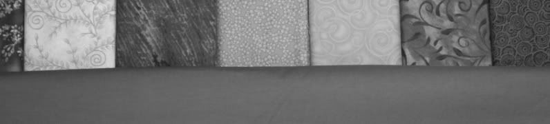
For those of us making quilts, it gets a little weird. Why? Because the thing about color theory is that it tends to be talking about solid samples, like paint chips. Those of us using fabric also have to consider a fabric's print and its scale. Trouble often arises when we attempt to harmonize several different prints, scales and values:
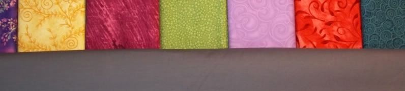
Pretty, right? Okay, so I just grabbed an assortment off of my stash shelves. Still, you get the idea. All these pretty colors and prints, but now what? There's a lot going on here, and the eye needs someplace to rest. A simple and effective solution is to add a neutral solid:
I grabbed my Kona Charcoal for this particular example. I'm very ambivalent about this particular shade of grey with these colors. Why? Because value just came into play:
That Kona charcoal is an almost exact value match for three of the seven fabrics. It shares value with the red print, in that the darker areas of red are very close in value. Due to these similarities in value, the Kona Charcoal ceases to be a neutral and just blends in with the other fabrics. The fact that it's a solid doesn't even save it from dulling out the other fabrics.


This makes the addition of the Charcoal pretty flat to me. In an instance like this, I'd probably go with white or black for higher value contrast. Unfortunately, I don't have solid white or black on hand to illustrate for you, so you'll have to use your imagine.


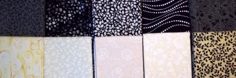
Now that we've added a neutral to a grouping of prints, what happens when we're working solely with neutrals?
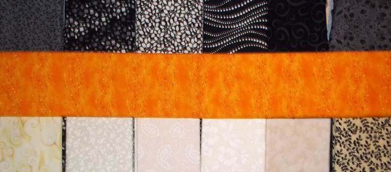
Well, we've got the extremes in scale and value pretty well covered. However, my eye keeps getting drawn to the white-on-white fabric, second from the  bottom right. It's very glaringly white.  I keep stopping at that one when I should continue travelling through the different fabrics, but it's not my neutral in this selection. At this point, they're all neutrals.
In this shot, the fabric got moved around a little, so I wasn't unnecessarily staring at the one that kept catching my eye before. However, notice that the orange added to the grouping is doing a couple of thing. It's serving as a mid-value in to the extremes of black and white. It's also the new resting point for the eye. Yes, in this case, orange is your neutral.


NEUTRALS IN YOUR FABRIC PALETTE


When does your fabric palette need a neutral? Honestly, I can't say that I've ever made a quilt that didn't use a neutral in some form. Every quilt that I've made has needed something to recede into the background so that the rest of the elements could gain preeminence.


But keep this in mind: A neutral is not necessarily a non-color!


A neutral can provide for you several things: a resting place, a unifying factor, a variation in value. Feel free to experiment, and hopefully this little segment helped a little.

Tuesday, April 12, 2011

DWR Quilt-Along - Let's Talk About Fabrics

It's been brought to my attention that McCall's has a free Double Wedding Ring paper piecing pattern available at their site.  Freespirit Fabrics also offers a free download here.  A big thank you to Tiffany for leading me to the McCall's pattern!  So, there are two more options for those of you want to participate.

Let's talk about fabrics!  Obviously, your biggest investment is going to be in the background fabric, should you opt to go with a single background fabric.  Check out Sandi's post, here, for some wonderful examples of a DWR drawn in EQ7 using multiple background fabrics for the melons (or footballs) and centers.  Now, just so we're clear...

THERE ARE NO WRONG CHOICES IN THIS QUILT ALONG!

Every coloring option is equally valid, whether you choose to go with a traditional palette and use off-white muslin for your centers and melons and feedsack reproductions for your arc centers and ends, or if you opt for a solid that coordinates with a favorite designer line.

Monochrome (also known as analogous), scrappy, or limited palette, is it all up to you.  I encourage you to share your choices on the Grey Cat Quilts Projects flicker group.  I would love to see them, and I would love to feature some of them here on the blog.  Posting your photos to the flickr group will not automatically grant me permission to re-post your photos here.  I will contact you and ask you for permission before posting.

I would like to start piecing next weekend, but don't worry!  There will be plenty of time for anyone to join in at any point.  I still have to buy fabrics - again.

Remember this?
Not the plan anymore.  I got silly, and drew this up in EQ7:
Yeah.  Now I need more fabric.  *facepalm*

Saturday, April 9, 2011

PM/GC Skill Builders Series Part 2B - Buying for a Project

Check out Sandi's 2B post!  And I'm sorry this took so god-awful long to get posted - I had a week of being really, really depressed and apathetic.  It was really hard to convince myself to do anything this week, even get out of bed.  I kept trying to work on this, but everything was just in a state of "ugh" and "meh".

On Sunday, you all got a brief peek in my head - apologies again...  I know it can be a pretty scary place.  LOL!

Anyway, today is a little bit more of the same.  Today, I'll walk you through some color theory, as well as how I select fabrics for a quilt.  I'm actually going to provide a couple of examples.  Now, obviously the fabrics are an integral part of designing a quilt, so you'll get some insight as to the internal monologue that goes on as I debate fabrics and their potential design use.  But first...

COLOR THEORY

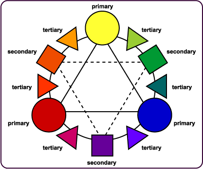
http://www.artsconnected.org/toolkit/encyc_colorwheel.html
I know...  Just the sight of a color wheel probably dredges up some memories of having to create one of these things in an art class long ago.  I know I did.

But why is this important?  Because every time you put a quilt together, you are a designer, and as a designer, there are some basics to be familiar with.  Color can evoke so much emotion...  Why else would we say we're feeling 'blue' when we feel sad?  Or that we're 'seeing red' when we're angry.

Color can be an effective communications tool, if you choose to utilize it.  I'm not saying it's wrong or bad to pick a color just because you like it.  There is absolutely nothing wrong with that, and it is a completely valid color selection method.  I'm just here to open a couple of doors for you.  And, honestly, I'm just skimming the surface here...  Entire books have been dedicated to this subject.

The Primary Colors we all know: red, blue, yellow.  These are the simplest hues, and cannot be broken down into other colors - all colors on the color wheel are mixed from the primary colors.  The Secondary Colors are violet, orange and green - they are the result of an an even mix of two of the primary colors, and also form a triangle.  Tertiary Colors are the in-between colors, yellow-green, red-violent. They're created by mixing a Primary Color and a Secondary Color.

Complementary Colors are the colors that are directly across from each other, like red and green, yellow and purple.  Using these colors together provide a lot of pop, because there's extreme contrast.  If you want something to stand out, use complementary colors.

Analogous Colors are those colors that are next to each other on the wheel: red, red-orange, yellow.  Monochromatic would be another way of saying this.  It's easy to match in this grouping.

Warm Colors are the reds, oranges and yellow on the color wheel.  Think summer and fire, the sun and baking.  Cool Colors are green, blue and violet.  Think winter and ice, rain and sleet.

Neutral Colors are your whites, creams, browns, and blacks, and grays.

Tints are pure colors mixed with white.  These, naturally, get lighter with more white.  Shades are pure colors mixed with black.  These become darker.
Shades and tints are wonderful to play with because they'll give you something that falls into the same color family, while altering the values in your quilt.  Oooh.. values!  

So, why does any of this matter?  Because color interaction is cool and fun to play with!  (The wanna-be graphic designer in me gets a little giddy occasionally.)  Knowing how the different colors interact will open a ton of possibilities for you.  Take a look at this, because I know I'm going to bork the actual explanation:


In the first example above, the red seems overwhelmed by the black.  Doesn't that red square in the middle of all that darkness seem so small compared to the others?  Surprise!  It's the exact same size as the rest of them.  Example 2, the blue and red sample, practically vibrates off the screen - there's a lot of energy going on there.  If you want to convey urgency and speed, use two primary colors together.  Ever notice how most fast food places use primary colors in their logo?  Yeah, that's totally deliberate.  

Example 3 is red on green - that's a primary on a secondary.  Notice, it's still got a lot of contrast, like Example 2, but it's a little more sedate.  Not much, but it's not quite so eye-boggling.  Example 4, shows how white can contain colors.  The red holds its own more than it did in Example 1.  Example 5 is a monochrome palette.  The red threatens to disappear into the background.  Example 6 utilizes my favorite neutral, gray.  Gray does a better job of allowing the red to stand on its own.

For some books on color theory and better explanation's on how color and quilts work, I'd highly suggest Joen Wolfrom.  She writes from a quilter's perspective, and has developed the 3-in-1 Color Tool to help purchasing fabrics easier.  If you don't mind textbooks, Understanding Color: An Introduction for Designers by Linda Holtzschue is a good one.

And now, for the fun part!  Actual fabric pics!  I'll walk you through picking colors/fabrics from an inspiration fabric and picking colors for diversity.

INSPIRATION FABRICS

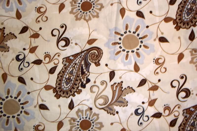
I'm a little weird, but you guys knew that already ;)  I joke, and say that I work my way in from the outside of a quilt, meaning that I start with my border print and go from there.  It's really not so much joking, though.  It really is how I work.  So, let's start with this particular bit of pretty:
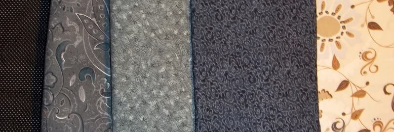
Now, I actually like this large scale print for a couple of different reasons.  I love the sensation of movement it has, and the updated, tiled paisleys scattered on it.  It's deceptively simple, because of the large amounts of background showing.  I like that there are actually quite a few colors in the print, but they're used very effectively together:  white, cream, baby blue, gun-metal gray, gray-blue, brown, and tan.  However...
I also like this print because it encompasses all the values I need for a quilt, from light to dark, which makes it an excellent starting point for mixing and matching.

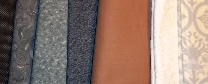
Step the first: adding an extreme.  I love this micro dot with my focus inspiration print.  It's actually challenging the cream fabric on three levels.  It's far more structured, as the dots occur at regular intervals and are all the same size.  It's a tiny, tiny print, compared to the focus print.  On top of that, it's just this side of black with just a touch of blue to it, just hovering on the darkest shades of charcoal gray.  It's also my dark dark, pulling the absolute darkest shades from the focus fabric.

Kind of freaky how much thought goes into just one fabric selection, isn't it?  This is why color selection is so difficult!  It's not just your tastes - it how the colors mix together to achieve the affect you as the designer are going for.

Let's add something else:
This middle print I actually shopped from Sandi's stash - it's nice to have friends who are so generous with their fabric! I like how this addition pulls that almost Prussian blue out of the focal print (hereafter referred to as FP, because I'm tired of typing that!), while giving me a middle ground in value.  It also mimics the movement of the FP, while appearing more sedate because the background color is so harmonious.

Let's add some more value differences:
Really happy so far - there's good differences in scale and value.  I'm moving from darkest dark to lightest light with little effort.  I'm still not happy though...  I'm completely skipping over the creams and browns.

Here, I've added some much needed variety.  I'm really digging the structure of the far right  print against the free motion of the FP, so that's good.  It also draws in the pale blue that's present.  I'm not too keen on the white tone on tone present.  It looks too washed out.  That will probably go, though I'll leave it for the moment.

On the whole, I'm really happy with this grouping of fabrics.  The only thing I feel is missing at this point is a blue solid or tone on tone to match the columbine blue flower petals.  Looking at the grouping I have, I'd like to bring in an oatmeal color tone on tone or solid and that blue.  Unfortunately, I don't have those on hand, but I think you guys get the idea.  This is why I buy large scale prints.

STARTING WITH A LIMITED PALETTE

I know a lot of you enjoy working with single fabric lines.   I've never before purchased the entirety of a fabric line, even in a pre-cut.  The closest I got was to buy a number of the prints from the Exclusively Quilters Eclipse line:
Gorgeous, right?  Honestly, this is the one fabric line that made my heart skip a beat when I saw it on the bolt.  And I know this totally violates my stance on sunshine yellow, but look at it!!

So, anyway, now that I'm done drooling anew (even though I bought this stuff last summer)...  This fabric is wonderful for this exercise because the palette is so limited.  We've got white, black, a couple shades of gray, and yellow.  However...

There's really only two scales represented here:  large and medium.  But wait!  What about the one on the right?  Look at the repeat a little closer:  It's almost the same size as the sunflower in the middle print, roughly 4" square.  The only thing that saves it from tippling over into being large scale is that it's drawn with thin lines.

But anyway, let's take a look at values, now that we've established that I'll need some small scale prints:
I know! It was pretty obvious right from the beginning that we had a dark dark (right print), and a light light (middle print).  The print on the left is a little hard to classify, because of the lighter colors on the background, but because of the way it's likely to show up when cut, I'd drop it in the light category.

Okay.  So now what?

Now we need some diversity.  Just three fabrics makes for a super dull quilt.  Looking at the three prints, I'm seeing a lot of curves.  Let's change things up a little:
I like this gray on gray stripe with the original fabrics quite a bit.  It brings some structure to the grouping.  But you know what?  It still needs something else...

Since I'm working from my stash for this exercise, I'm extremely limited in the number of yellow fabrics I have to work with, but I'm also not sure at this point that I would do a lot of cutting into the yellow floral print.  I already know that I'm not going to fussy cut this stuff - I'm far too lazy for that.  Besides, if I fussy cut, I lose that glorious yellow, and I want to preserve as much of that as I can.  I'm thinking that it would be nice as an inner border - but that's a step for the design phase!


However, I'm limited in yellow, and this quilt needs more color to it.  I've got lots of neutrals.  I really don't need to add any.  My challenge here is to find a clear, clean color that works well with yellow and gray.  I
already know that I'm not going to be playing with red, orange or green.  All three of those colors are analogous to yellow, and I want something more diverse.  However, having said this, I know I'm not playing with purple.  Purple is too dark for my purposes in this instance and tints like lavender don't have enough value difference.

No green, because acid and lime green are really what I buy, and there's not enough value difference, though I do love the contrast of the squares of the middle fabric against the scrolls of the main fabrics.  If all else fails, then I 'll attempt to pull out the dark shades of teal-green that are in that fabric.  Same story with orange - just not enough value difference, and orange is too close on the color wheel to make me happy.  Red shows some promise, but then the gray, white and black are overwhelmed, not showcased alongside the red and yellow.

So, considering my stash at this point, I'm left with aquas and magentas.
Okay, so my magenta stash sucks, because I've been buying a lot of softer pinks, which is just odd for me.  Still...  The top right, basket weave print is cool, but there's too much white.  I really like the very straight movement that the top left print gives, and it gives me a number of pinks to work with.  The bottom 'magenta' leans too much to purple, and has too much gray in it.

Magenta's out, for the moment.  Lets take a look at aquas:
Hmmm...  My first impression is that I'm getting rid of the large scale aqua and white print on the left.  The print is too distracting and doesn't harmonize with the movement I've already got going on.  Plus, it's another large scale print, and I've got plenty of that happening right now.

Let's try adding something darker:
Right idea, wrong shade.  You can see how much gray is in that right hand print.  It's drawing the eye, but not in a good way.  Wrong quilt for this deep, grayed down teal.
Now we're getting somewhere...  The middle scroll like print would fill in my need for another mid-scale print, while serving as the dark for the aquas.  It also harmonizes the left hand print, which is a perfect small scale print.  I like the hint of dark in the third print in the top row, but it's also a 'reads as solid', which will give the viewer a place to rest their eyes.  The far right print, unfortunately, also suffers from wrong shade syndrome.

And look what I found while I was digging!  I knew I had that yellow print in the top left corner somewhere - it got buried in the wrong pile.  But I'm happy.. I can bring more yellow in, and this yellow is so clear and clean that I would want to match it exactly - and that's one of the few instances that you'll find me going for an exact match.  But now I need more value contrast:
Much happier!  Although, I'll be removing the more graphic print, and going with the two on the right.

One of these days, I'll make quilts out of these two examples, and link you back to this.  D'oh!  I just added two more projects to the to-do list.

Hopefully, this was helpful.  Again, so, so sorry for the delay.  I'll be making a concentrated effort to be on task after this.